# Pearson and Lee heights: regression to the mean
Source: `PearsonLee/heights.Rmd`
Karl Pearson and Alice Lee's family-height data are used in Chapter 6 to illustrate a basic linear regression: adult daughters' heights are predicted from their mothers' heights. This Python port keeps the original workflow: load the tabulated heights, fit the line, and draw the sequence of explanatory plots.
## Setup and data
```{python}
from pathlib import Path
import numpy as np
import pandas as pd
import matplotlib.pyplot as plt
import statsmodels.formula.api as smf

root = Path("/Users/alal/tmp/ros-python-book/ROS-Examples")
rng = np.random.default_rng(1903)

heights = pd.read_csv(root / "PearsonLee/data/Heights.txt", sep=r"\s+")
heights.head()
```
```{python}
heights.describe().round(2)
```
## Linear regression
The R page uses `stan_glm(daughter_height ~ mother_height)`. The core fitted line is the least-squares line; with weak default priors the posterior center from `stan_glm` is very close to this estimate.
```{python}
fit = smf.ols("daughter_height ~ mother_height", data=heights).fit()
a_hat = fit.params["Intercept"]
b_hat = fit.params["mother_height"]

pd.DataFrame({
    "coef": fit.params,
    "se": fit.bse,
    "t": fit.tvalues,
}).round(3)
```
```{python}
pd.Series({
    "mean mother height": heights["mother_height"].mean(),
    "mean daughter height": heights["daughter_height"].mean(),
    "correlation": heights[["mother_height", "daughter_height"]].corr().iloc[0, 1],
    "slope": b_hat,
    "intercept": a_hat,
    "residual sd": np.sqrt(fit.scale),
}).round(3)
```
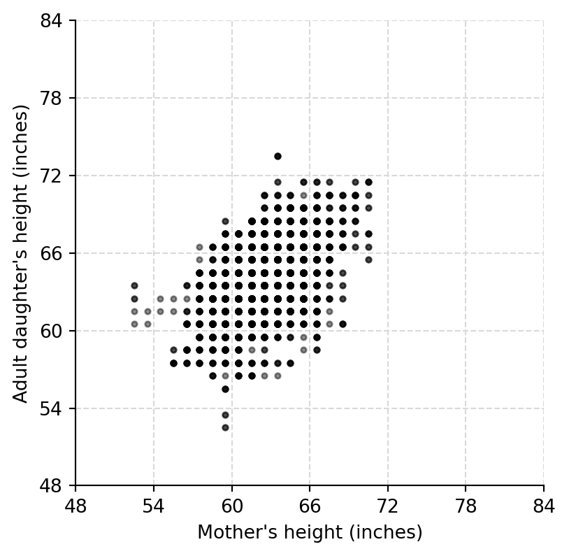
## Scatterplot and fitted line
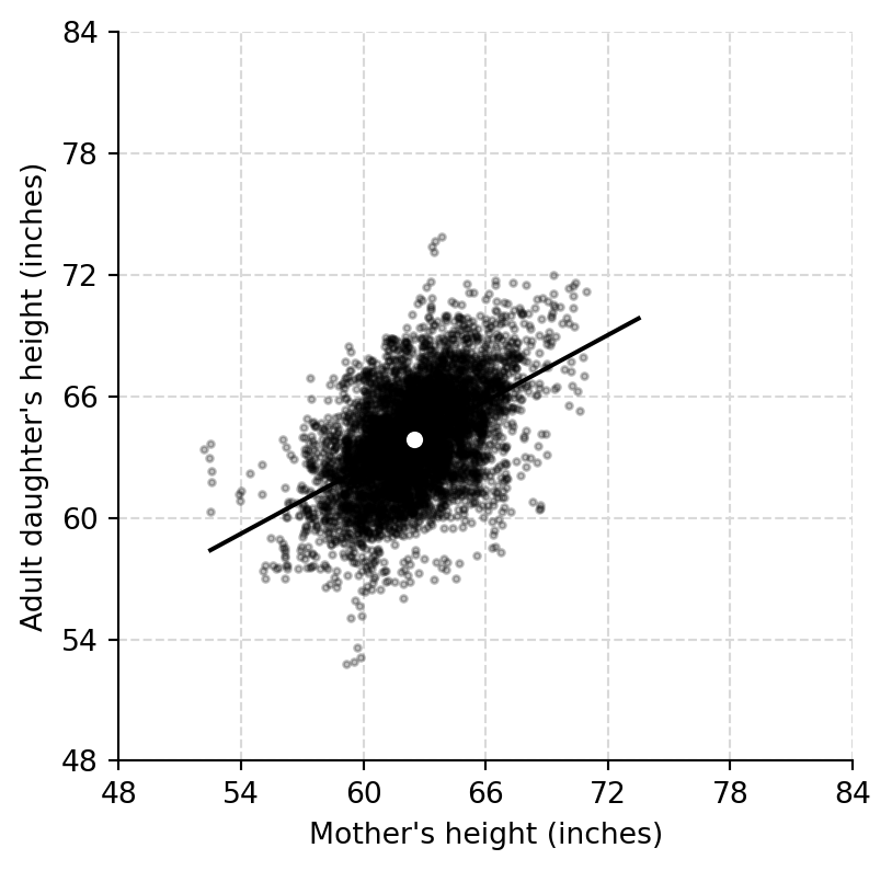
The raw values are heavily rounded, so a jittered display shows the density of repeated mother-daughter height pairs.
```{python}
def add_height_grid(ax, ticks=np.arange(48, 85, 6)):
    ax.set_xticks(ticks)
    ax.set_yticks(ticks)
    for tick in ticks:
        ax.axhline(tick, color="0.85", lw=0.8, ls="--", zorder=0)
        ax.axvline(tick, color="0.85", lw=0.8, ls="--", zorder=0)
    ax.spines[["top", "right"]].set_visible(False)

mother = heights["mother_height"].to_numpy()
daughter = heights["daughter_height"].to_numpy()
rng_heights = (min(mother.min(), daughter.min()), max(mother.max(), daughter.max()))

fig, ax = plt.subplots(figsize=(4.5, 4.5))
ax.scatter(mother, daughter, s=8, color="black", alpha=0.45)
ax.set(xlabel="Mother's height (inches)", ylabel="Adult daughter's height (inches)", xlim=rng_heights, ylim=rng_heights)
add_height_grid(ax)
```
```{python}
mother_jit = mother + rng.uniform(-0.5, 0.5, size=len(mother))
daughter_jit = daughter + rng.uniform(-0.5, 0.5, size=len(daughter))
xs = np.linspace(rng_heights[0], rng_heights[1], 200)

fig, ax = plt.subplots(figsize=(4.5, 4.5))
ax.scatter(mother_jit, daughter_jit, s=5, color="black", alpha=0.25)
ax.plot(xs, a_hat + b_hat * xs, color="black", lw=1.5)
ax.scatter([mother.mean()], [daughter.mean()], s=45, color="white", edgecolor="black", zorder=3)
ax.set(xlabel="Mother's height (inches)", ylabel="Adult daughter's height (inches)", xlim=rng_heights, ylim=rng_heights)
add_height_grid(ax)
```
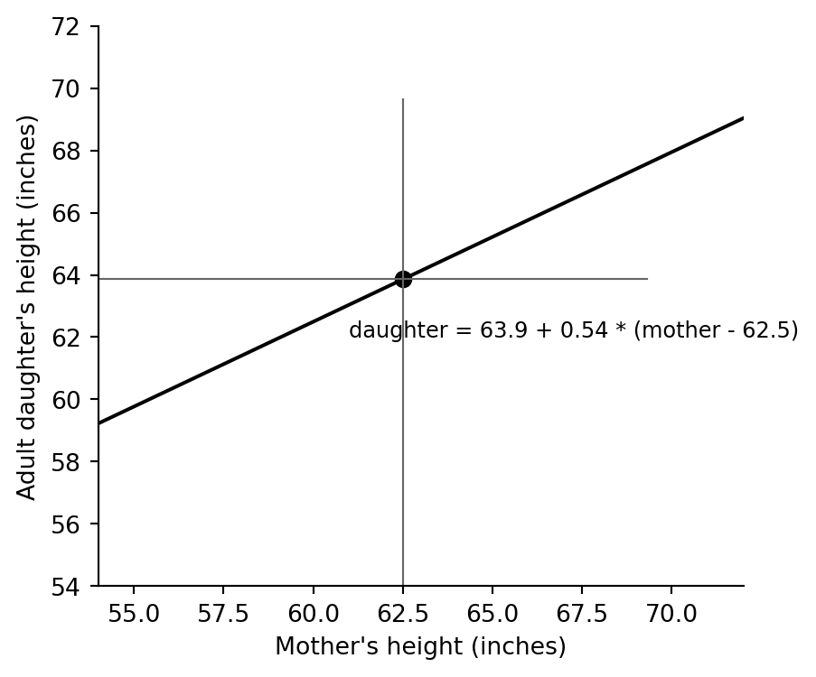
## The line through the data average
A least-squares line with an intercept always passes through `(mean(x), mean(y))`. This is the centered version of the same equation.
```{python}
centered_equation = f"daughter = {daughter.mean():.1f} + {b_hat:.2f} * (mother - {mother.mean():.1f})"
standard_equation = f"daughter = {a_hat:.1f} + {b_hat:.2f} * mother"

pd.Series({
    "standard equation": standard_equation,
    "centered equation": centered_equation,
})
```
```{python}
fig, ax = plt.subplots(figsize=(4.8, 4.2))
ax.plot(xs, a_hat + b_hat * xs, color="black", lw=1.5)
ax.axvline(mother.mean(), ymax=(daughter.mean() / rng_heights[1]), color="0.4", lw=0.8)
ax.axhline(daughter.mean(), xmax=(mother.mean() / rng_heights[1]), color="0.4", lw=0.8)
ax.scatter([mother.mean()], [daughter.mean()], s=40, color="black")
ax.text(61, 62, centered_equation, fontsize=9)
ax.set(xlabel="Mother's height (inches)", ylabel="Adult daughter's height (inches)", xlim=(54, 72), ylim=(54, 72))
ax.spines[["top", "right"]].set_visible(False)
```
The slope is well below one: very tall mothers have daughters who are predicted to be tall, but closer to the population average. This is the regression-to-the-mean pattern highlighted by the original example.