# Mile / record times
Source: `Mile/mile.Rmd`
The mile example is a compact illustration of linear regression: record times decline over calendar time, and the fitted line can be interpreted as an average annual improvement in seconds. The R original uses `rstanarm::stan_glm`; the Python port uses `statsmodels` for the least-squares summary and the lightweight Bayesian linear-regression helper for posterior lines.
## Setup and data
```{python}
from pathlib import Path
import numpy as np
import pandas as pd
import matplotlib.pyplot as plt
import statsmodels.formula.api as smf
from python.bayes_glm import bayes_lm


def ros_root():
    candidates = [
        Path("../../ROS-Examples"),
        Path("../ROS-Examples"),
        Path("/Users/alal/tmp/ros-python-book/ROS-Examples"),
    ]
    for candidate in candidates:
        if candidate.exists():
            return candidate
    return candidates[0]

root = ros_root()
mile = pd.read_csv(root / "Mile/data/mile.csv")
mile.head()
```
```{python}
mile[["year", "seconds"]].describe()
```
## Linear model
```{python}
fit = smf.ols("seconds ~ year", data=mile).fit()
fit_bayes = bayes_lm("seconds ~ year", data=mile, draws=1000, prior_scale=10.0, seed=3104)
fit.summary()
```
```{python}
years = np.array([1900, 2000])
approx = 1007 - 0.393 * years
exact = fit.params["Intercept"] + fit.params["year"] * years
pd.DataFrame({"year": years, "book_approx_seconds": approx, "ols_seconds": exact})
```
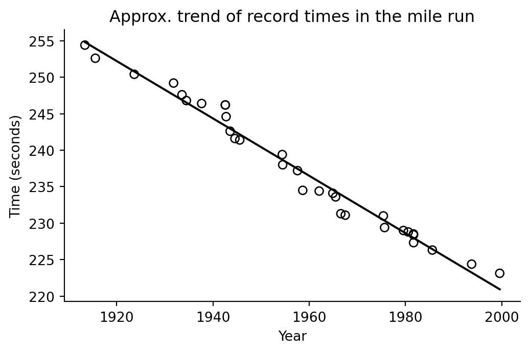
The slope is negative: in this historical record data, each additional calendar year is associated with a lower record time.
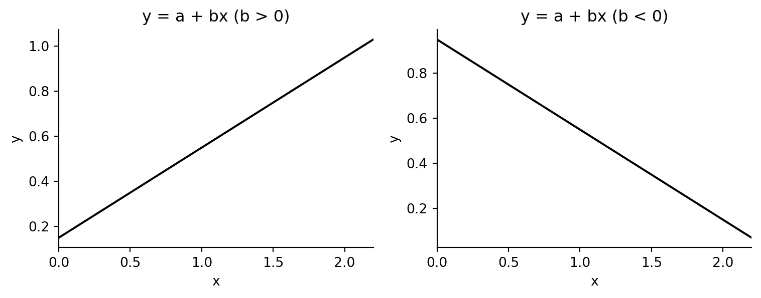
## Simple line examples
```{python}
fig, axes = plt.subplots(1, 2, figsize=(8, 3.2))
for ax, a, b, title in [
    (axes[0], 0.15, 0.4, "y = a + bx (b > 0)"),
    (axes[1], 0.95, -0.4, "y = a + bx (b < 0)"),
]:
    xs = np.linspace(0, 2.2, 100)
    ax.plot(xs, a + b * xs, color="black")
    ax.set_xlim(0, 2.2)
    ax.set_xlabel("x")
    ax.set_ylabel("y")
    ax.set_title(title)
    ax.spines[["top", "right"]].set_visible(False)
fig.tight_layout()
```
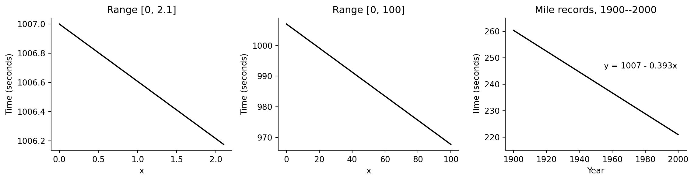
## Trend line on different x scales
```{python}
fig, axes = plt.subplots(1, 3, figsize=(12, 3.2))
for ax, lo, hi, xlabel, title in [
    (axes[0], 0, 2.1, "x", "Range [0, 2.1]"),
    (axes[1], 0, 100, "x", "Range [0, 100]"),
    (axes[2], 1900, 2000, "Year", "Mile records, 1900--2000"),
]:
    xs = np.linspace(lo, hi, 200)
    ax.plot(xs, 1007 - 0.393 * xs, color="black")
    ax.set_xlabel(xlabel)
    ax.set_ylabel("Time (seconds)")
    ax.set_title(title)
    ax.spines[["top", "right"]].set_visible(False)
axes[2].set_ylim(215, 265)
axes[2].text(1955, 246, "y = 1007 - 0.393x")
fig.tight_layout()
```
## Data with fitted regression line
```{python}
xs = np.linspace(mile["year"].min(), mile["year"].max(), 200)
ys = fit.params["Intercept"] + fit.params["year"] * xs

fig, ax = plt.subplots(figsize=(6, 3.6))
ax.scatter(mile["year"], mile["seconds"], facecolors="none", edgecolors="black")
ax.plot(xs, ys, color="black")
ax.set_xlabel("Year")
ax.set_ylabel("Time (seconds)")
ax.set_title("Approx. trend of record times in the mile run")
ax.spines[["top", "right"]].set_visible(False)
```
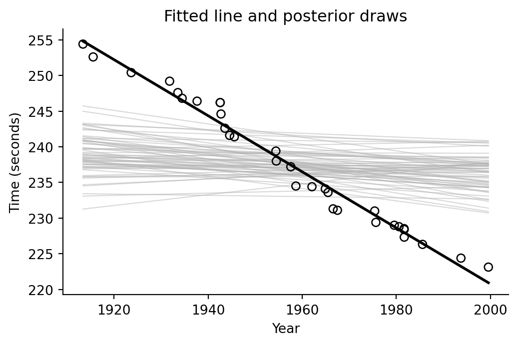
## Posterior lines
For this Gaussian regression, the helper draws coefficients and residual scale from a conjugate Bayesian linear-model posterior. These lines visualize uncertainty in the fitted trend without requiring a Stan run.
```{python}
beta_draws = fit_bayes.beta_draws[:200]

fig, ax = plt.subplots(figsize=(6, 3.6))
ax.scatter(mile["year"], mile["seconds"], facecolors="none", edgecolors="black", zorder=3)
for beta in beta_draws[:60]:
    ax.plot(xs, beta[0] + beta[1] * xs, color="0.7", linewidth=0.8, alpha=0.5)
ax.plot(xs, ys, color="black", linewidth=2)
ax.set_xlabel("Year")
ax.set_ylabel("Time (seconds)")
ax.set_title("Fitted line and posterior draws")
ax.spines[["top", "right"]].set_visible(False)
```
## CmdStanPy note
```{python}
#| eval: false
from cmdstanpy import CmdStanModel

# The Stan analogue is a normal linear regression:
# seconds[n] ~ normal(alpha + beta * year[n], sigma).
# Centering year before sampling is recommended because the raw intercept is far
# from the observed data range.
```