Code
import numpy as np
import pandas as pd
import matplotlib.pyplot as plt
import statsmodels.formula.api as smf
from scipy.special import expit, logit

rng = np.random.default_rng(14014)Source: LogitGraphs/logitgraphs.Rmd
This example shows several ways to display logistic regression: raw binary data with fitted curves, binned averages, and discrimination lines for a model with two predictors. The original page uses stan_glm; here statsmodels fits the same logistic likelihood by maximum likelihood.
import numpy as np
import pandas as pd
import matplotlib.pyplot as plt
import statsmodels.formula.api as smf
from scipy.special import expit, logit
rng = np.random.default_rng(14014)n = 50
a = 2
b = 3
x_mean = -a / b
x_sd = 4 / b
x = rng.normal(x_mean, x_sd, size=n)
y = rng.binomial(1, expit(a + b * x))
fake_1 = pd.DataFrame({"x": x, "y": y})
fake_1.head()| x | y | |
|---|---|---|
| 0 | -1.457298 | 0 |
| 1 | -1.840753 | 0 |
| 2 | -1.216585 | 0 |
| 3 | 2.052998 | 1 |
| 4 | -0.063965 | 0 |
fit_1 = smf.logit("y ~ x", data=fake_1).fit(disp=False)
a_hat = fit_1.params["Intercept"]
b_hat = fit_1.params["x"]
fit_1.summary()| Dep. Variable: | y | No. Observations: | 50 |
|---|---|---|---|
| Model: | Logit | Df Residuals: | 48 |
| Method: | MLE | Df Model: | 1 |
| Date: | Sun, 31 May 2026 | Pseudo R-squ.: | 0.5068 |
| Time: | 23:03:37 | Log-Likelihood: | -17.074 |
| converged: | True | LL-Null: | -34.617 |
| Covariance Type: | nonrobust | LLR p-value: | 3.153e-09 |
| coef | std err | z | P>|z| | [0.025 | 0.975] | |
|---|---|---|---|---|---|---|
| Intercept | 1.8147 | 0.637 | 2.847 | 0.004 | 0.566 | 3.064 |
| x | 2.8411 | 0.772 | 3.679 | 0.000 | 1.327 | 4.355 |
def shifted(values, delta=0.008):
    values = np.asarray(values)
    return np.where(values == 0, delta, np.where(values == 1, 1 - delta, values))

x_grid = np.linspace(x.min() - 0.5, x.max() + 0.5, 300)

fig, ax = plt.subplots(figsize=(7, 4.5))
ax.scatter(x, shifted(y), color="black", s=25)
ax.plot(x_grid, expit(a + b * x_grid), color="0.25", label="true curve")
ax.plot(x_grid, expit(a_hat + b_hat * x_grid), color="0.25", linestyle="--", label="fitted curve")
ax.set_ylim(0, 1)
ax.set_xlabel("x")
ax.set_ylabel("y")
ax.legend(frameon=False)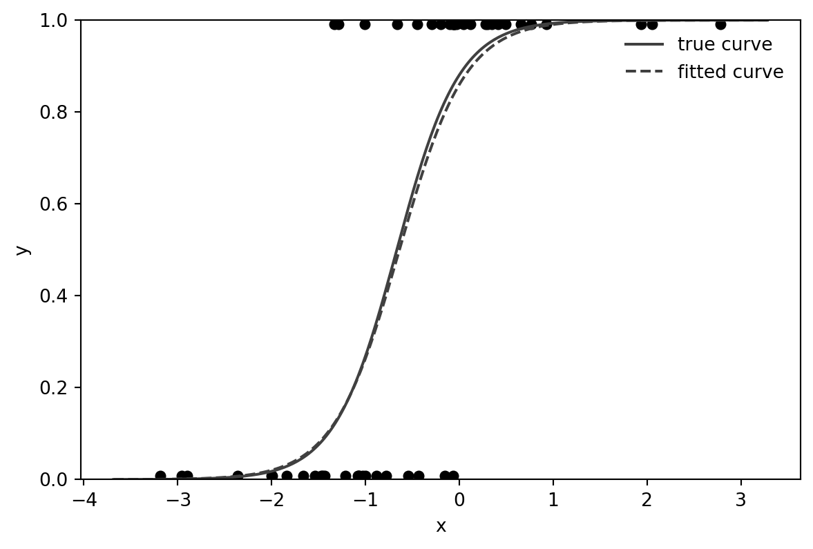
The vertical shift keeps the binary observations visible without pretending that the outcomes are continuous.
K = 5
fake_1["bin"] = pd.cut(fake_1["x"], bins=K)
binned = fake_1.groupby("bin", observed=True).agg(x_bar=("x", "mean"), y_bar=("y", "mean"), n=("y", "size"))
binned| x_bar | y_bar | n | |
|---|---|---|---|
| bin | |||
| (-3.191, -1.991] | -2.567395 | 0.0000 | 6 |
| (-1.991, -0.798] | -1.275010 | 0.1875 | 16 |
| (-0.798, 0.396] | -0.142363 | 0.7500 | 20 |
| (0.396, 1.59] | 0.648396 | 1.0000 | 5 |
| (1.59, 2.783] | 2.257293 | 1.0000 | 3 |
fig, ax = plt.subplots(figsize=(7, 4.5))
ax.scatter(fake_1["x"], shifted(fake_1["y"]), color="0.55", s=22, label="data")
ax.scatter(binned["x_bar"], shifted(binned["y_bar"], delta=0.02), s=90, facecolor="white", edgecolor="black", label="bin averages")
ax.plot(x_grid, expit(a_hat + b_hat * x_grid), color="black", linewidth=1)
ax.set_ylim(0, 1)
ax.set_xlabel("x")
ax.set_ylabel("y")
ax.set_title("Data and binned averages")
ax.legend(frameon=False)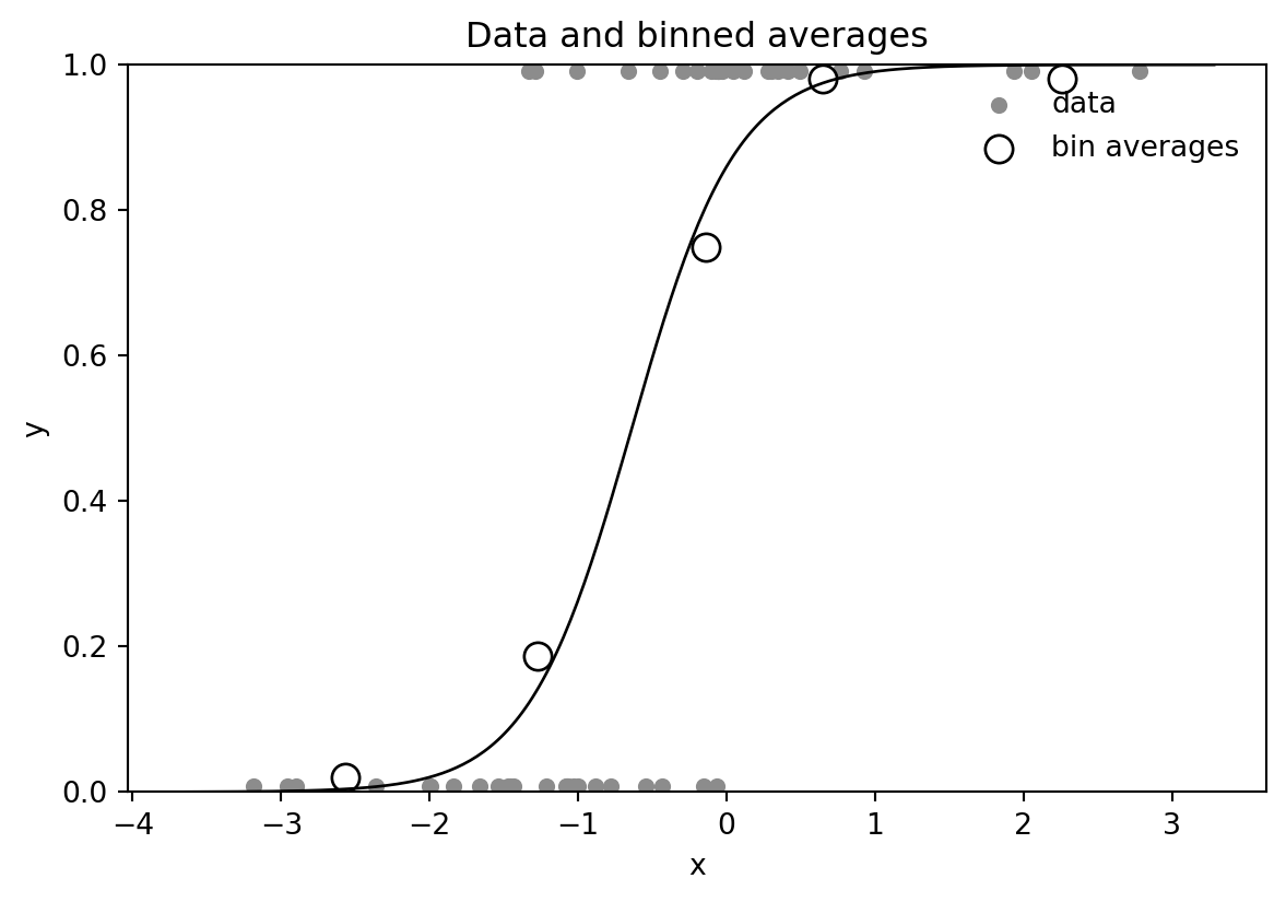
Binning is only a display device: the model is still fit to the individual binary observations.
n = 100
beta = np.array([2, 3, 4])
x1 = rng.normal(0, 0.4, size=n)
x2 = rng.normal(-0.5, 0.4, size=n)
linpred = beta[0] + beta[1] * x1 + beta[2] * x2
y = rng.binomial(1, expit(linpred))
fake_2 = pd.DataFrame({"x1": x1, "x2": x2, "y": y})
fake_2.head()| x1 | x2 | y | |
|---|---|---|---|
| 0 | -0.281543 | -0.478992 | 0 |
| 1 | 0.005012 | -0.727271 | 0 |
| 2 | -0.845535 | -0.299932 | 1 |
| 3 | -0.023915 | -0.021838 | 1 |
| 4 | -0.134852 | 0.454685 | 1 |
fit_2 = smf.logit("y ~ x1 + x2", data=fake_2).fit(disp=False)
beta_hat = fit_2.params[["Intercept", "x1", "x2"]].to_numpy()
fit_2.summary()| Dep. Variable: | y | No. Observations: | 100 |
|---|---|---|---|
| Model: | Logit | Df Residuals: | 97 |
| Method: | MLE | Df Model: | 2 |
| Date: | Sun, 31 May 2026 | Pseudo R-squ.: | 0.5280 |
| Time: | 23:03:37 | Log-Likelihood: | -32.707 |
| converged: | True | LL-Null: | -69.295 |
| Covariance Type: | nonrobust | LLR p-value: | 1.288e-16 |
| coef | std err | z | P>|z| | [0.025 | 0.975] | |
|---|---|---|---|---|---|---|
| Intercept | 3.6698 | 0.852 | 4.305 | 0.000 | 1.999 | 5.340 |
| x1 | 4.2329 | 1.075 | 3.939 | 0.000 | 2.127 | 6.339 |
| x2 | 6.7458 | 1.463 | 4.610 | 0.000 | 3.878 | 9.614 |
For a fixed probability p, the line is the set of predictor values satisfying a + b1*x1 + b2*x2 = logit(p).
def discrimination_line(beta_vec, p, x_values):
    return (logit(p) - beta_vec[0] - beta_vec[1] * x_values) / beta_vec[2]

x1_grid = np.linspace(fake_2["x1"].min() - 0.15, fake_2["x1"].max() + 0.15, 200)

fig, ax = plt.subplots(figsize=(7, 5))
ax.scatter(fake_2.loc[fake_2["y"] == 0, "x1"], fake_2.loc[fake_2["y"] == 0, "x2"], color="black", s=22, label="y=0")
ax.scatter(fake_2.loc[fake_2["y"] == 1, "x1"], fake_2.loc[fake_2["y"] == 1, "x2"], facecolor="white", edgecolor="black", s=36, label="y=1")
for p, style in [(0.1, "--"), (0.5, "-"), (0.9, "--")]:
    ax.plot(x1_grid, discrimination_line(beta_hat, p, x1_grid), color="black", linestyle=style, label=f"Pr(y=1)={p:.1f}")
ax.set_xlabel("x1")
ax.set_ylabel("x2")
ax.set_title("Data and 10%, 50%, 90% fitted discrimination lines")
ax.legend(frameon=False, loc="best")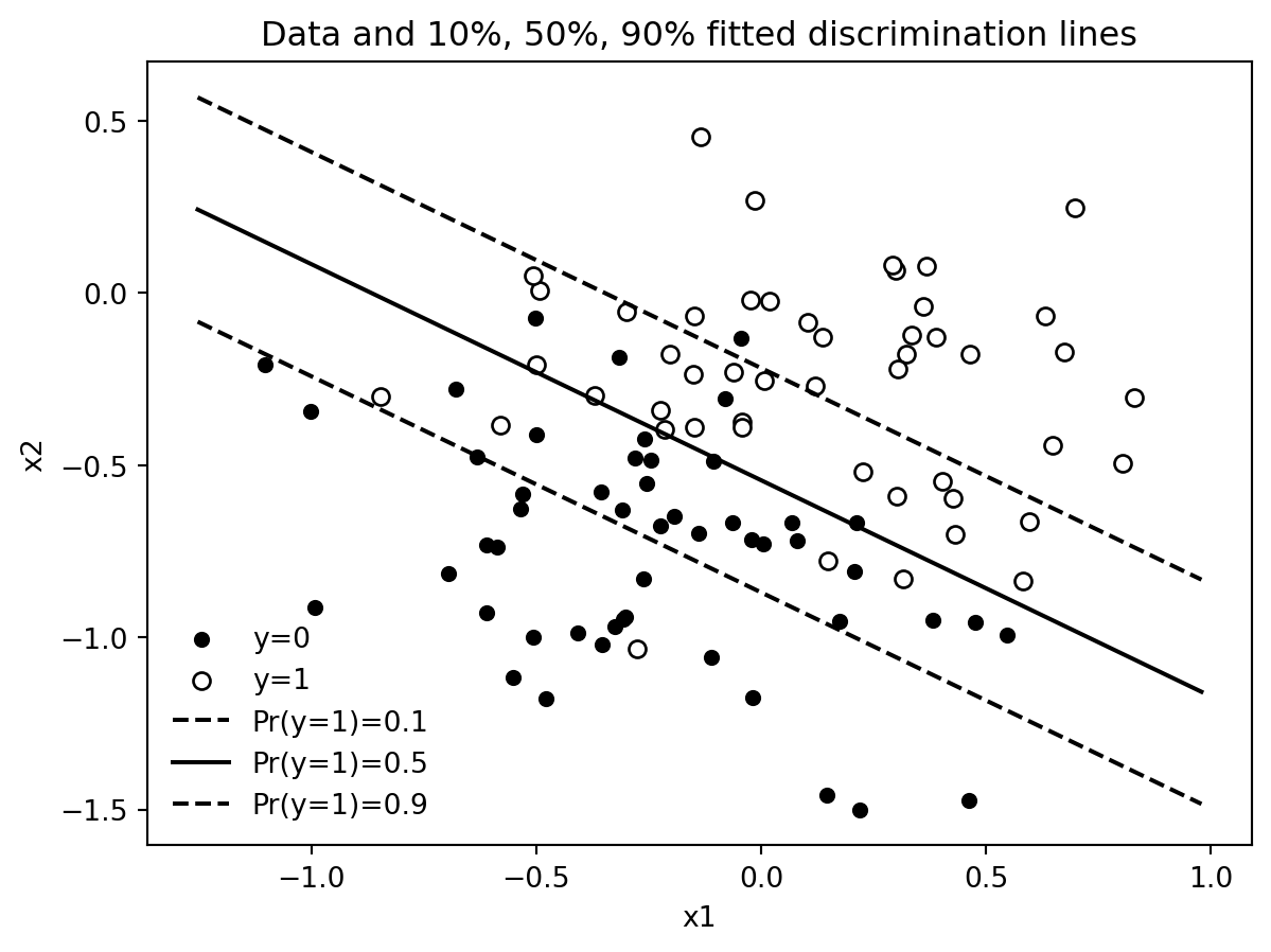
pd.DataFrame({
    "true": beta,
    "fitted_mle": beta_hat,
}, index=["Intercept", "x1", "x2"])| true | fitted_mle | |
|---|---|---|
| Intercept | 2 | 3.669789 |
| x1 | 3 | 4.232908 |
| x2 | 4 | 6.745842 |
With two predictors, the logistic regression curve becomes a surface. The contour lines at probabilities 0.1, 0.5, and 0.9 are often easier to read than a three-dimensional surface.