# Pearson and Lee heights: the fitted line in context
Source: `PearsonLee/PearsonLee.Rmd`
This companion page uses the same Pearson-Lee height data but emphasizes how to read the fitted line: first by itself, then in the range where the data actually live. The original R script makes a sequence of simple base-R graphics; this port reproduces the same statistical objects and matplotlib displays.
## Setup and fit
```{python}
from pathlib import Path
import numpy as np
import pandas as pd
import matplotlib.pyplot as plt
import statsmodels.formula.api as smf

root = Path("/Users/alal/tmp/ros-python-book/ROS-Examples")
rng = np.random.default_rng(1903)

heights = pd.read_csv(root / "PearsonLee/data/Heights.txt", sep=r"\s+")
mother_height = heights["mother_height"].to_numpy()
daughter_height = heights["daughter_height"].to_numpy()
n = len(heights)

fit = smf.ols("daughter_height ~ mother_height", data=heights).fit()
ab_hat = fit.params
ab_hat.round(3)
```
```{python}
pd.Series({
    "n": n,
    "mother mean": mother_height.mean(),
    "daughter mean": daughter_height.mean(),
    "mother sd": mother_height.std(ddof=1),
    "daughter sd": daughter_height.std(ddof=1),
    "r": np.corrcoef(mother_height, daughter_height)[0, 1],
    "R-squared": fit.rsquared,
}).round(3)
```
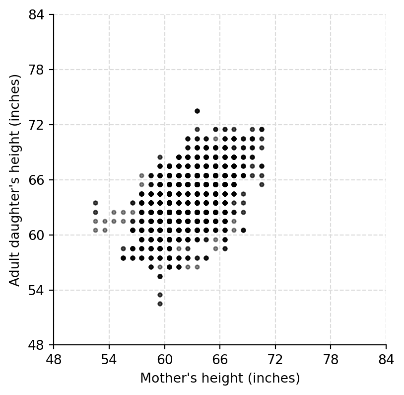
## Raw and jittered data
```{python}
def clean_axes(ax):
    ax.spines[["top", "right"]].set_visible(False)

def height_grid(ax, ticks=np.arange(48, 85, 6)):
    ax.set_xticks(ticks)
    ax.set_yticks(ticks)
    for tick in ticks:
        ax.axhline(tick, color="0.86", lw=0.8, ls="--", zorder=0)
        ax.axvline(tick, color="0.86", lw=0.8, ls="--", zorder=0)
    clean_axes(ax)

height_range = (min(mother_height.min(), daughter_height.min()), max(mother_height.max(), daughter_height.max()))

fig, ax = plt.subplots(figsize=(4.5, 4.5))
ax.scatter(mother_height, daughter_height, s=8, color="black", alpha=0.45)
ax.set(xlabel="Mother's height (inches)", ylabel="Adult daughter's height (inches)", xlim=height_range, ylim=height_range)
height_grid(ax)
```
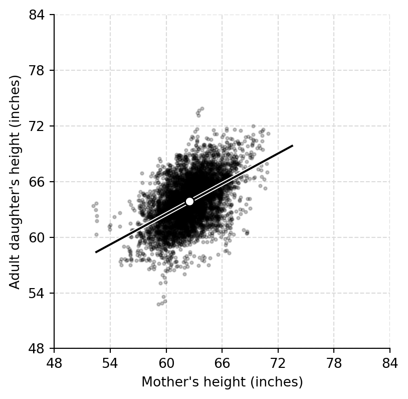
```{python}
mother_jitt = mother_height + rng.uniform(-0.5, 0.5, size=n)
daughter_jitt = daughter_height + rng.uniform(-0.5, 0.5, size=n)

fig, ax = plt.subplots(figsize=(4.5, 4.5))
ax.scatter(mother_jitt, daughter_jitt, s=5, color="black", alpha=0.25)
ax.set(xlabel="Mother's height (inches)", ylabel="Adult daughter's height (inches)", xlim=height_range, ylim=height_range)
height_grid(ax)
```
## Data, average point, and regression line
```{python}
a_hat = ab_hat["Intercept"]
b_hat = ab_hat["mother_height"]
xs = np.linspace(height_range[0], height_range[1], 200)

fig, ax = plt.subplots(figsize=(4.5, 4.5))
ax.scatter(mother_jitt, daughter_jitt, s=5, color="black", alpha=0.22)
ax.plot(xs, a_hat + b_hat * xs, color="white", lw=3)
ax.plot(xs, a_hat + b_hat * xs, color="black", lw=1.5)
ax.scatter([mother_height.mean()], [daughter_height.mean()], s=45, color="white", edgecolor="black", zorder=3)
ax.set(xlabel="Mother's height (inches)", ylabel="Adult daughter's height (inches)", xlim=height_range, ylim=height_range)
height_grid(ax)
```
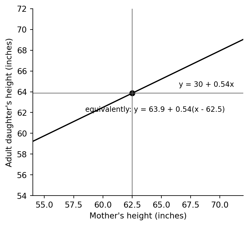
```{python}
fig, ax = plt.subplots(figsize=(4.7, 4.2))
ax.plot(xs, a_hat + b_hat * xs, color="black", lw=1.5)
ax.axvline(mother_height.mean(), color="0.4", lw=0.8)
ax.axhline(daughter_height.mean(), color="0.4", lw=0.8)
ax.scatter([mother_height.mean()], [daughter_height.mean()], s=40, color="black")
ax.text(66.5, 64.5, f"y = {a_hat:.0f} + {b_hat:.2f}x", fontsize=9)
ax.text(58.5, 62.1, f"equivalently: y = {daughter_height.mean():.1f} + {b_hat:.2f}(x - {mother_height.mean():.1f})", fontsize=9)
ax.set(xlabel="Mother's height (inches)", ylabel="Adult daughter's height (inches)", xlim=(54, 72), ylim=(54, 72))
clean_axes(ax)
```
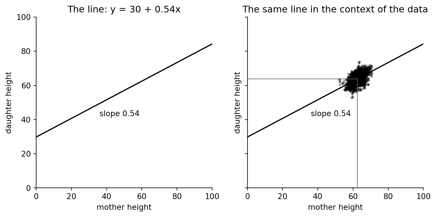
## The line alone can be misleading
The source page draws the fitted line on a `0--100` inch canvas and then redraws it with the data. The intercept is mathematically part of the line, but it is far outside the empirical range of mother heights, so it should not be given a literal interpretation.
```{python}
fig, axes = plt.subplots(1, 2, figsize=(9, 4), sharex=True, sharey=True)
for ax in axes:
    ax.set(xlim=(0, 100), ylim=(0, 100), xlabel="mother height", ylabel="daughter height")
    ax.axhline(0, color="black", lw=0.8)
    ax.axvline(0, color="black", lw=0.8)
    ax.plot([0, 100], [a_hat, a_hat + b_hat * 100], color="black", lw=1.5)
    ax.text(36, 42, f"slope {b_hat:.2f}")
    clean_axes(ax)

axes[0].set_title(f"The line: y = {a_hat:.0f} + {b_hat:.2f}x")
axes[1].scatter(mother_jitt, daughter_jitt, s=5, color="black", alpha=0.25)
axes[1].axvline(mother_height.mean(), ymax=daughter_height.mean() / 100, color="0.4", lw=0.8)
axes[1].axhline(daughter_height.mean(), xmax=mother_height.mean() / 100, color="0.4", lw=0.8)
axes[1].set_title("The same line in the context of the data")
```
The fitted slope is a relationship within the observed height range. Extrapolating the line down to zero inches only demonstrates the algebraic intercept; it is not a plausible biological prediction.