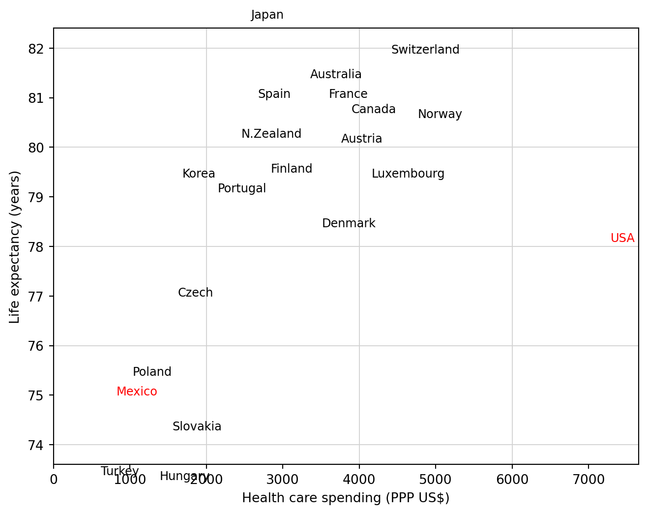
The graph emphasizes a descriptive comparison: the United States is an outlier in spending relative to life expectancy, while Mexico is highlighted as another reference country.
Code
from pathlib import Pathimport pandas as pdimport matplotlib.pyplot as pltroot = Path("../../ROS-Examples")health = pd.read_table(root /"HealthExpenditure/data/healthdata.txt", sep=r"\s+")health.head()
remove = health.country.isin(["Netherlands", "Belgium", "Germany", "Ireland", "Iceland", "Greece", "Italy", "Sweden", "UK"])fig, ax = plt.subplots(figsize=(8, 6))for _, r in health.loc[~remove].iterrows(): col ="red"if r.country in ["USA", "Mexico"] else"black" ax.text(r.spending, r.lifespan, r.country, color=col, fontsize=9)for x in [2000, 4000, 6000]: ax.axvline(x, color="lightgray", linewidth=.7)for y in [74, 76, 78, 80, 82]: ax.axhline(y, color="lightgray", linewidth=.7)ax.set_xlim(0, 1.05*health.spending.max())ax.set_xlabel("Health care spending (PPP US$)")ax.set_ylabel("Life expectancy (years)")
Text(0, 0.5, 'Life expectancy (years)')
Source Code
# Health expenditure and life expectancySource: `HealthExpenditure/healthexpenditure.Rmd`The graph emphasizes a descriptive comparison: the United States is an outlier in spending relative to life expectancy, while Mexico is highlighted as another reference country.```{python}from pathlib import Pathimport pandas as pdimport matplotlib.pyplot as pltroot = Path("../../ROS-Examples")health = pd.read_table(root /"HealthExpenditure/data/healthdata.txt", sep=r"\s+")health.head()```## All countries```{python}colors = health.country.where(health.country.isin(["USA", "Mexico"]), other="other")colors = colors.map({"USA": "red", "Mexico": "red", "other": "black"})fig, ax = plt.subplots(figsize=(8, 6))for _, r in health.iterrows(): ax.text(r.spending, r.lifespan, r.country, color=colors.loc[r.name], fontsize=8)ax.set_xlim(0, 1.05*health.spending.max())ax.set_xlabel("Health care spending (PPP US$)")ax.set_ylabel("Life expectancy (years)")```## Less cluttered display```{python}remove = health.country.isin(["Netherlands", "Belgium", "Germany", "Ireland", "Iceland", "Greece", "Italy", "Sweden", "UK"])fig, ax = plt.subplots(figsize=(8, 6))for _, r in health.loc[~remove].iterrows(): col ="red"if r.country in ["USA", "Mexico"] else"black" ax.text(r.spending, r.lifespan, r.country, color=col, fontsize=9)for x in [2000, 4000, 6000]: ax.axvline(x, color="lightgray", linewidth=.7)for y in [74, 76, 78, 80, 82]: ax.axhline(y, color="lightgray", linewidth=.7)ax.set_xlim(0, 1.05*health.spending.max())ax.set_xlabel("Health care spending (PPP US$)")ax.set_ylabel("Life expectancy (years)")```