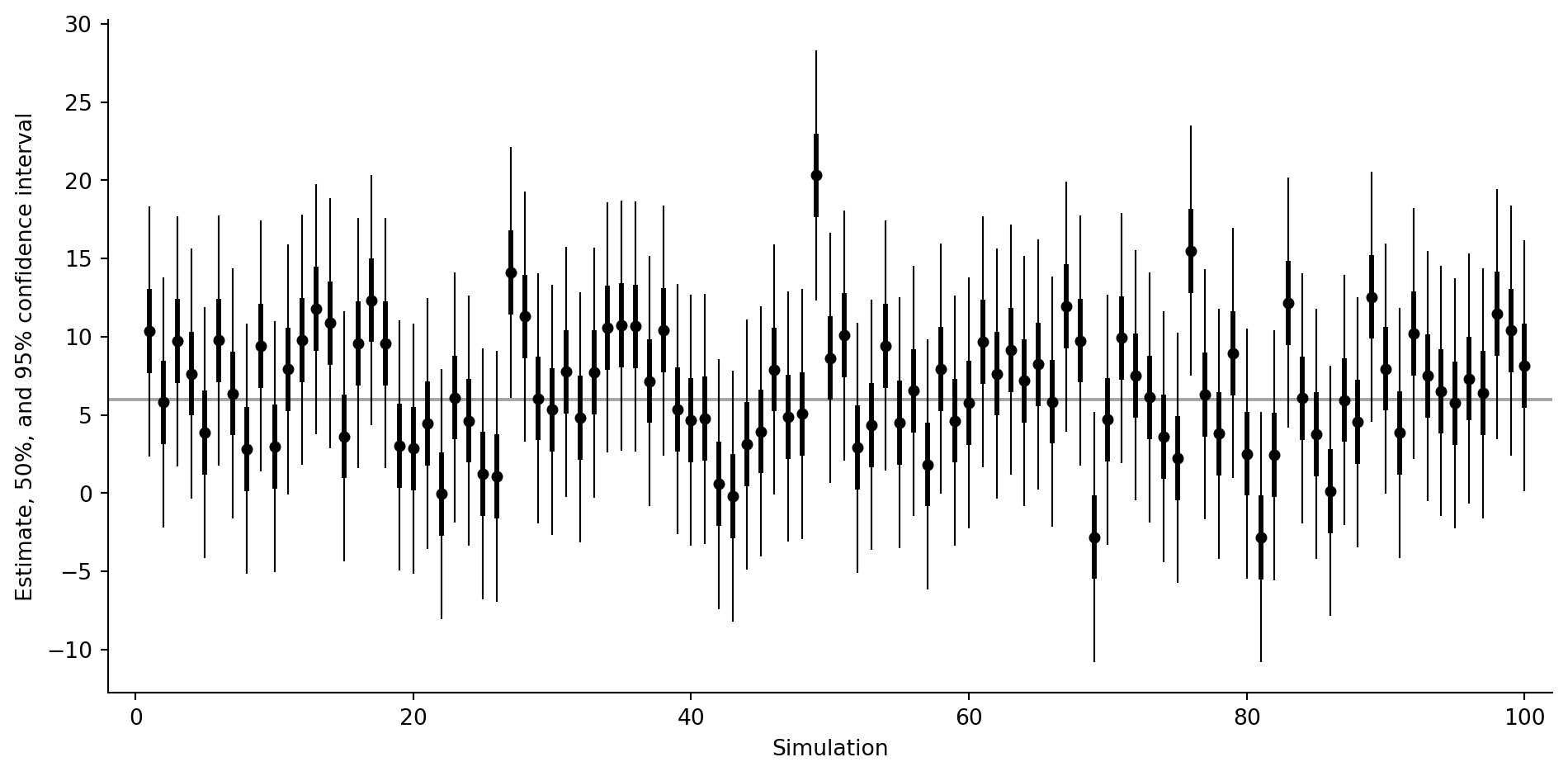
This page ports the Chapter 4 interval-coverage simulation. We repeatedly observe one noisy measurement from a normal population with known standard deviation, then draw the estimate together with nominal 50% and 95% intervals. The gray horizontal line marks the true mean.
Simulate repeated measurements
Code
import numpy as npimport pandas as pdimport matplotlib.pyplot as pltrng = np.random.default_rng(1507)n_rep =100mu =6.0sigma =4.0est = rng.normal(loc=mu, scale=sigma, size=n_rep)intervals = pd.DataFrame({"simulation": np.arange(1, n_rep +1),"estimate": est,"lo95": est -2.0* sigma,"lo50": est -0.67* sigma,"hi50": est +0.67* sigma,"hi95": est +2.0* sigma,})intervals.head()
The plot matches the structure of the R version: a point estimate for each simulated experiment, a thick central interval, and a thin wider interval. Intervals missing the gray line are the visible noncoverage cases.
Source Code
# Coverage / coverageSource: `Coverage/coverage.Rmd`This page ports the Chapter 4 interval-coverage simulation. We repeatedly observe one noisy measurement from a normal population with known standard deviation, then draw the estimate together with nominal 50% and 95% intervals. The gray horizontal line marks the true mean.## Simulate repeated measurements```{python}import numpy as npimport pandas as pdimport matplotlib.pyplot as pltrng = np.random.default_rng(1507)n_rep =100mu =6.0sigma =4.0est = rng.normal(loc=mu, scale=sigma, size=n_rep)intervals = pd.DataFrame({"simulation": np.arange(1, n_rep +1),"estimate": est,"lo95": est -2.0* sigma,"lo50": est -0.67* sigma,"hi50": est +0.67* sigma,"hi95": est +2.0* sigma,})intervals.head()```## Empirical coverage in this run```{python}coverage_95 = ((intervals["lo95"] <= mu) & (mu <= intervals["hi95"])).mean()coverage_50 = ((intervals["lo50"] <= mu) & (mu <= intervals["hi50"])).mean()round(coverage_50, 2), round(coverage_95, 2)```With only 100 simulations these proportions move around, but across many repeats they concentrate near the intervals' nominal coverage.## Plot estimates and intervals```{python}fig, ax = plt.subplots(figsize=(10, 5))ax.axhline(mu, color="0.65", lw=1.5, zorder=0)for row in intervals.itertuples(index=False): ax.vlines(row.simulation, row.lo95, row.hi95, color="black", lw=0.8) ax.vlines(row.simulation, row.lo50, row.hi50, color="black", lw=2.2)ax.scatter(intervals["simulation"], intervals["estimate"], color="black", s=18, zorder=3)ax.set_xlim(-2, n_rep +2)ax.set_xlabel("Simulation")ax.set_ylabel("Estimate, 50%, and 95% confidence interval")ax.spines[["top", "right"]].set_visible(False)fig.tight_layout()```The plot matches the structure of the R version: a point estimate for each simulated experiment, a thick central interval, and a thin wider interval. Intervals missing the gray line are the visible noncoverage cases.