# Human Development Index by state
Source: `HDI/hdi.Rmd`
This example looks at U.S. state HDI several ways: as a scatterplot against average income, as rank comparisons, and as geographic/color-coded context.
```{python}
from pathlib import Path
import numpy as np
import pandas as pd
import matplotlib.pyplot as plt

root = Path("../../ROS-Examples")
hdi = pd.read_table(root / "HDI/data/hdi.dat", sep=r"\s+")
votes = pd.read_stata(root / "HDI/data/state vote and income, 68-00.dta")
hdi.head(), votes.head()
```
## Align HDI with state income
```{python}
state_abbr = ['AL','AK','AZ','AR','CA','CO','CT','DE','FL','GA','HI','ID','IL','IN','IA','KS','KY','LA','ME','MD','MA','MI','MN','MS','MO','MT','NE','NV','NH','NJ','NM','NY','NC','ND','OH','OK','OR','PA','RI','SC','SD','TN','TX','UT','VT','VA','WA','WV','WI','WY']
state_names = ['Alabama','Alaska','Arizona','Arkansas','California','Colorado','Connecticut','Delaware','Florida','Georgia','Hawaii','Idaho','Illinois','Indiana','Iowa','Kansas','Kentucky','Louisiana','Maine','Maryland','Massachusetts','Michigan','Minnesota','Mississippi','Missouri','Montana','Nebraska','Nevada','New Hampshire','New Jersey','New Mexico','New York','North Carolina','North Dakota','Ohio','Oklahoma','Oregon','Pennsylvania','Rhode Island','South Carolina','South Dakota','Tennessee','Texas','Utah','Vermont','Virginia','Washington','West Virginia','Wisconsin','Wyoming']
state_abbr_long = state_abbr[:8] + ['DC'] + state_abbr[8:]
state_name_long = state_names[:8] + ['Washington, D.C.'] + state_names[8:]
income2000 = votes.loc[votes.st_year == 2000, 'st_income'].to_numpy()
state_income = np.r_[income2000[:8], np.nan, income2000[8:50]]
hdi_by_state = hdi.set_index('state')
hdi_ordered = np.array([hdi_by_state.loc[s, 'hdi'] if s in hdi_by_state.index else np.nan for s in state_name_long])
can = np.array([hdi_by_state.loc[s, 'canada.dist'] if s in hdi_by_state.index else np.nan for s in state_name_long])
no_dc = np.array(state_abbr_long) != 'DC'
```
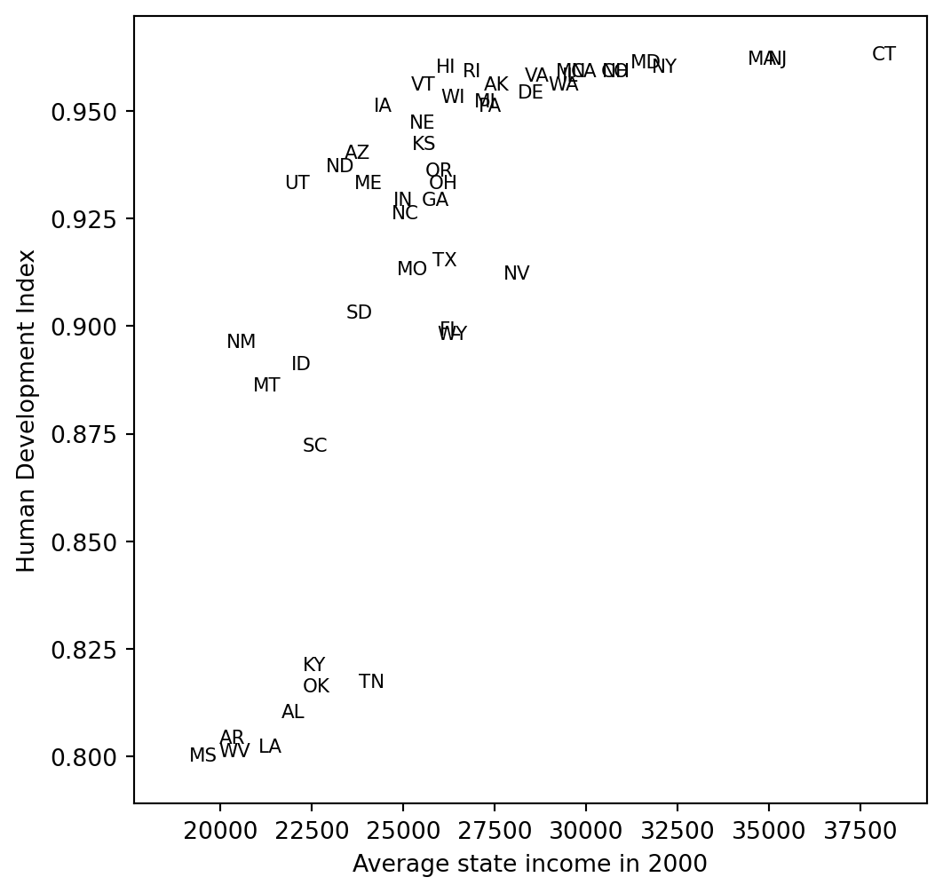
## Income versus HDI
```{python}
fig, ax = plt.subplots(figsize=(6, 6))
for x, y, lab in zip(state_income, hdi_ordered, state_abbr_long):
    if np.isfinite(x) and np.isfinite(y):
        ax.text(x, y, lab, fontsize=8)
finite = np.isfinite(state_income) & np.isfinite(hdi_ordered)
ax.set_xlim(np.nanmin(state_income[finite]) - 1500, np.nanmax(state_income[finite]) + 1500)
ax.set_ylim(np.nanmin(hdi_ordered[finite]) - 0.01, np.nanmax(hdi_ordered[finite]) + 0.01)
ax.set_xlabel("Average state income in 2000")
ax.set_ylabel("Human Development Index")
```
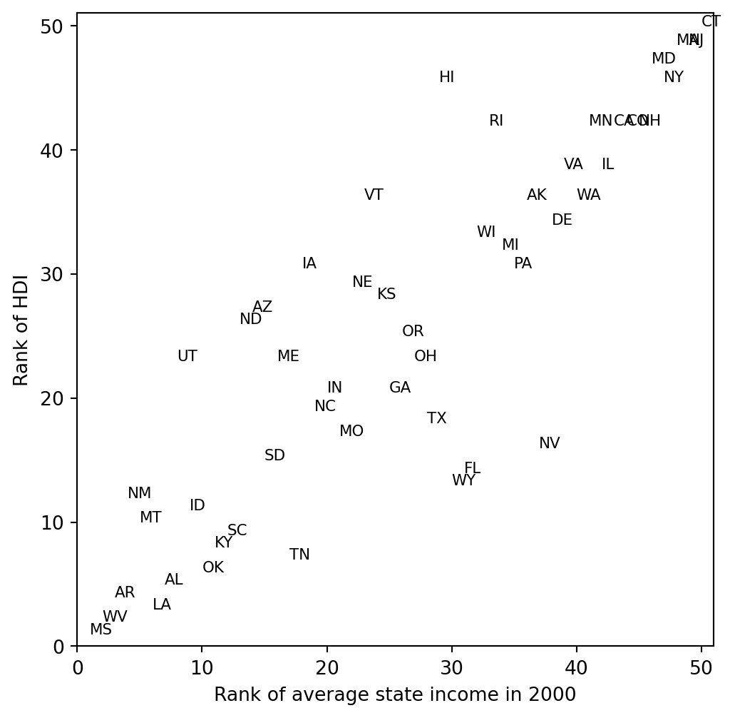
```{python}
rank_income = pd.Series(state_income[no_dc]).rank().to_numpy()
rank_hdi = pd.Series(hdi_ordered[no_dc]).rank().to_numpy()
print("rank correlation:", np.corrcoef(rank_hdi, rank_income)[0,1])
fig, ax = plt.subplots(figsize=(6, 6))
for x, y, lab in zip(rank_income, rank_hdi, state_abbr):
    ax.text(x, y, lab, fontsize=8)
ax.set_xlim(0, 51)
ax.set_ylim(0, 51)
ax.set_xlabel("Rank of average state income in 2000")
ax.set_ylabel("Rank of HDI")
```
A full U.S. map requires a geographic boundary package. The port keeps the ranked and labeled comparisons; the `canada.dist` variable can be used for later choropleth work.