Code
import numpy as np
import matplotlib.pyplot as plt
from scipy.stats import norm

savefigs = FalseSource: Balance/treatcontrol.Rmd
This example is a set of schematic normal-density pictures used in Chapter 20 to separate a causal comparison from a predictive comparison. The R page draws eleven bell curves with different centers and vertical scales. The Python port below keeps the same parameters and makes the figure-generating function explicit.
import numpy as np
import matplotlib.pyplot as plt
from scipy.stats import norm
savefigs = Falsedef bell(mu, sd=0.4, lo=0.3, hi=5.7, ymax=2.0, ax=None, title=None):
"""Draw the normal curve used in the ROS balance/treatment-control figure."""
if ax is None:
_, ax = plt.subplots(figsize=(9, 3))
x = np.linspace(lo, hi, 500)
ax.plot(x, norm.pdf(x, loc=mu, scale=sd), color="black", lw=2)
ax.set_xlim(lo, hi)
ax.set_ylim(0, ymax)
ax.set_xlabel("")
ax.set_ylabel("")
ax.set_yticks([])
ax.spines[["left", "right", "top"]].set_visible(False)
if title:
ax.set_title(title)
return axcurves = [
("bell1h", 2.0, 0.4, 0.3, 5.7, 1.0),
("bell1l", 2.0, 0.4, 0.3, 5.7, 3.0),
("bell2", 3.0, 0.4, 0.3, 5.7, 2.0),
("bell3l", 4.0, 0.4, 0.3, 5.7, 3.0),
("bell3h", 4.0, 0.4, 0.3, 5.7, 1.0),
("bell4l", 1.5, 0.4, 0.3, 5.7, 3.0),
("bell5h", 2.5, 0.4, 0.3, 5.7, 1.0),
("bell5", 2.5, 0.4, 0.3, 5.7, 2.0),
("bell6", 3.5, 0.4, 0.3, 5.7, 2.0),
("bell6h", 3.5, 0.4, 0.3, 5.7, 1.0),
("bell7l", 4.5, 0.4, 0.3, 5.7, 3.0),
]
fig, axes = plt.subplots(4, 3, figsize=(12, 9), sharex=True)
for ax, (name, mu, sd, lo, hi, ymax) in zip(axes.ravel(), curves):
bell(mu, sd, lo, hi, ymax, ax=ax, title=f"{name}: mean={mu}")
for ax in axes.ravel()[len(curves):]:
ax.axis("off")
fig.tight_layout()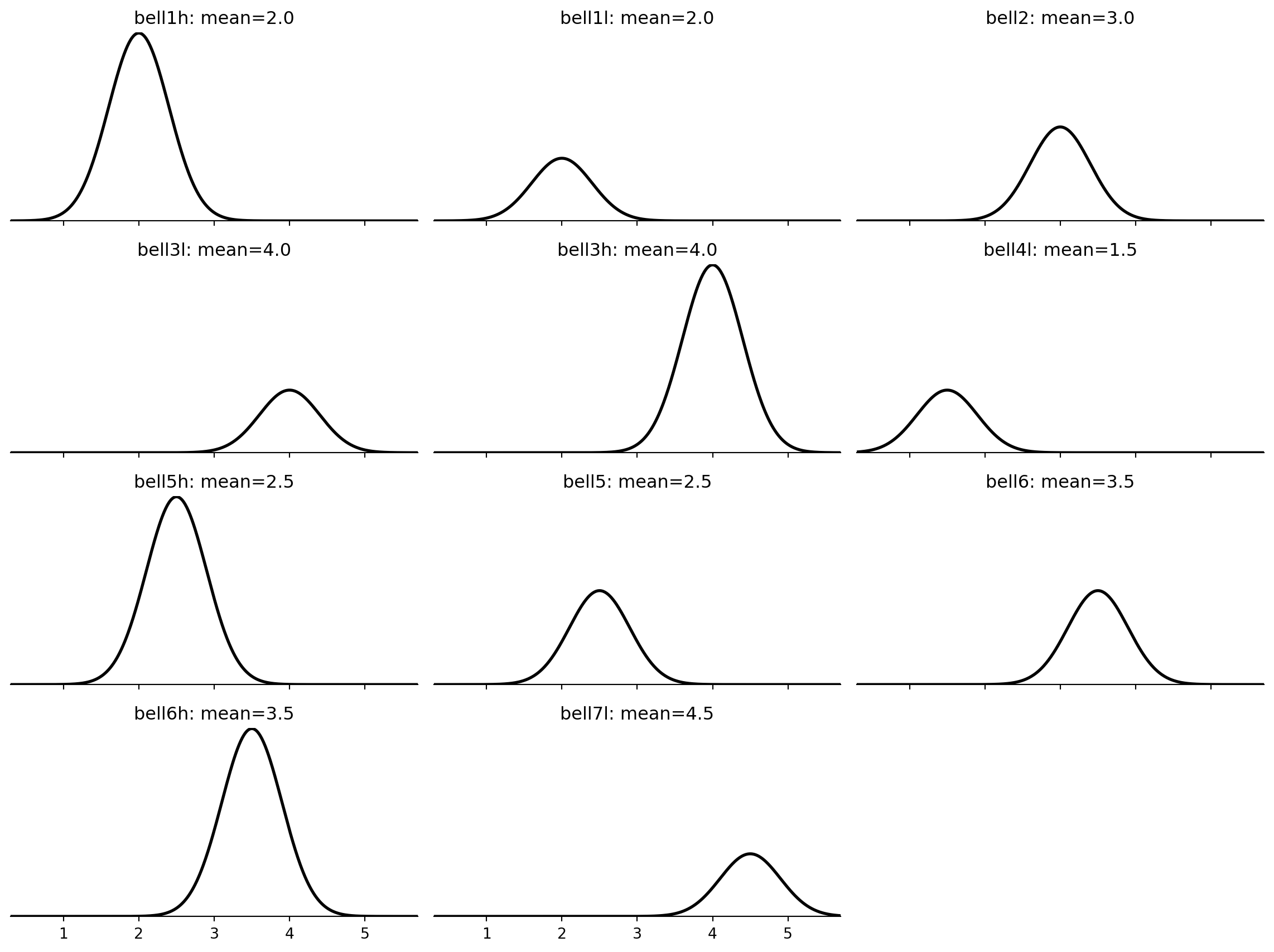
The different vertical scales are intentional: the original figure is not comparing densities by area in a single panel. It uses the same normal curve shape as a visual building block for a treatment/control balance story.