Show code
from pathlib import Path

import matplotlib.pyplot as plt
import numpy as np
import pandas as pd

import crabbymetrics as cm

np.set_printoptions(precision=4, suppress=True)


data_dir = Path("../data/ding")Correlation, adjustment, and Simpson’s paradox
Chapter 1 mixes three related ideas:
from pathlib import Path
import matplotlib.pyplot as plt
import numpy as np
import pandas as pd
import crabbymetrics as cm
np.set_printoptions(precision=4, suppress=True)
data_dir = Path("../data/ding")The original notebook starts with the Lalonde-style CPS comparison. Here the point is simple: the treatment coefficient can move a long way once we control for observable differences.
cps = pd.read_table(data_dir / "cps1re74.csv", delimiter=" ")
cps["u74"] = (cps["re74"] == 0).astype(float)
cps["u75"] = (cps["re75"] == 0).astype(float)
y = cps["re78"].to_numpy(dtype=float)

naive = cm.OLS()
naive.fit(cps[["treat"]].to_numpy(dtype=float), y)

covariates = [
    "treat",
    "age",
    "educ",
    "black",
    "hispan",
    "married",
    "nodegree",
    "re74",
    "re75",
    "u74",
    "u75",
]
adjusted = cm.OLS()
adjusted.fit(cps[covariates].to_numpy(dtype=float), y)

regression_table = pd.DataFrame(
    {
        "estimate": [
            naive.summary()["coef"][0],
            adjusted.summary()["coef"][0],
        ],
        "se_hc1": [
            naive.summary(vcov="hc1")["coef_se"][0],
            adjusted.summary(vcov="hc1")["coef_se"][0],
        ],
    },
    index=["Unadjusted", "Adjusted"],
)
regression_table| estimate | se_hc1 | |
|---|---|---|
| Unadjusted | -8506.495361 | 581.926350 |
| Adjusted | 1067.546135 | 626.846411 |
The Bertrand-Mullainathan resume data are a clean reminder that some causal contrasts are already visible in simple grouped means.
resume = pd.read_csv(data_dir / "resume.csv")

callback_rates = (
    resume.groupby(["race", "sex"], observed=False)["call"]
    .agg(["mean", "size"])
    .rename(columns={"mean": "callback_rate", "size": "n"})
)
callback_rates| callback_rate | n | ||
|---|---|---|---|
| race | sex | ||
| black | female | 0.066278 | 1886 |
| male | 0.058288 | 549 | |
| white | female | 0.098925 | 1860 |
| male | 0.088696 | 575 |
callback_plot = (
    resume.groupby(["race", "sex"], observed=False)["call"]
    .mean()
    .unstack("sex")
    .loc[["black", "white"]]
)

fig, ax = plt.subplots(figsize=(6, 4))
callback_plot.plot(kind="bar", ax=ax, rot=0)
ax.set_ylabel("Callback rate")
ax.set_title("Resume callbacks by race and sex")
fig.tight_layout()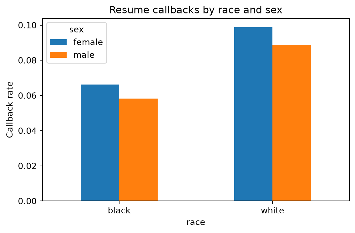
The R script also uses the classic Berkeley admissions table to show Simpson’s paradox in a real contingency-table setting. The pooled admission-rate difference favors men, while most department-specific differences are small or move in the other direction.
ucb_counts = pd.DataFrame(
    [
        ("A", "Male", 512, 313),
        ("A", "Female", 89, 19),
        ("B", "Male", 353, 207),
        ("B", "Female", 17, 8),
        ("C", "Male", 120, 205),
        ("C", "Female", 202, 391),
        ("D", "Male", 138, 279),
        ("D", "Female", 131, 244),
        ("E", "Male", 53, 138),
        ("E", "Female", 94, 299),
        ("F", "Male", 22, 351),
        ("F", "Female", 24, 317),
    ],
    columns=["department", "gender", "admitted", "rejected"],
)
ucb_counts["applications"] = ucb_counts["admitted"] + ucb_counts["rejected"]
ucb_counts["admit_rate"] = ucb_counts["admitted"] / ucb_counts["applications"]

pooled = (
    ucb_counts.groupby("gender")[["admitted", "applications"]]
    .sum()
    .assign(admit_rate=lambda d: d["admitted"] / d["applications"])
)
pooled_diff = pooled.loc["Male", "admit_rate"] - pooled.loc["Female", "admit_rate"]

dept_rates = ucb_counts.pivot(index="department", columns="gender", values="admit_rate")
dept_rates["male_minus_female"] = dept_rates["Male"] - dept_rates["Female"]

pd.concat(
    [
        pd.DataFrame({"male_minus_female": [pooled_diff]}, index=["Pooled"]),
        dept_rates[["male_minus_female"]],
    ]
)| male_minus_female | |
|---|---|
| Pooled | 0.141645 |
| A | -0.203468 |
| B | -0.049643 |
| C | 0.028590 |
| D | -0.018398 |
| E | 0.038301 |
| F | -0.011400 |
Within each group below, the relationship between \(x\) and \(y\) is positive. Pooled together, it becomes negative because the high-\(x\) group also has a much lower intercept.
rng = np.random.default_rng(1)
n_group = 160
group = np.repeat([0.0, 1.0], n_group)
x = np.r_[rng.normal(-1.0, 0.6, n_group), rng.normal(2.5, 0.6, n_group)]
y = np.r_[
    3.5 + 0.9 * x[:n_group] + rng.normal(0.0, 0.35, n_group),
    -2.5 + 0.9 * x[n_group:] + rng.normal(0.0, 0.35, n_group),
]

pooled = cm.OLS()
pooled.fit(x[:, None], y)

adjusted_simpson = cm.OLS()
adjusted_simpson.fit(np.column_stack([x, group]), y)

simpson_table = pd.DataFrame(
    {
        "slope_on_x": [
            pooled.summary()["coef"][0],
            adjusted_simpson.summary()["coef"][0],
        ]
    },
    index=["Pooled", "Adjusted for group"],
)
simpson_table| slope_on_x | |
|---|---|
| Pooled | -0.665827 |
| Adjusted for group | 0.893378 |
grid = np.linspace(x.min() - 0.2, x.max() + 0.2, 100)
pooled_summary = pooled.summary()
adj_summary = adjusted_simpson.summary()

fig, ax = plt.subplots(figsize=(6, 4))
ax.scatter(x[group == 0.0], y[group == 0.0], alpha=0.6, label="Group 0")
ax.scatter(x[group == 1.0], y[group == 1.0], alpha=0.6, label="Group 1")
ax.plot(
    grid,
    pooled_summary["intercept"] + pooled_summary["coef"][0] * grid,
    color="black",
    linewidth=2.0,
    label="Pooled line",
)
ax.plot(
    grid,
    adj_summary["intercept"] + adj_summary["coef"][0] * grid,
    color="tab:red",
    linewidth=2.0,
    linestyle="--",
    label="Adjusted slope at group 0",
)
ax.set_xlabel("x")
ax.set_ylabel("y")
ax.set_title("Simpson's paradox from pooled versus adjusted regression")
ax.legend()
fig.tight_layout()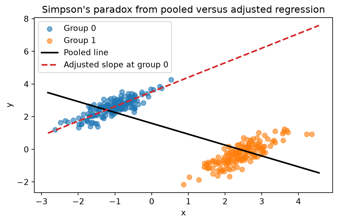
Chapter 1 is mostly about interpretation discipline. crabbymetrics.OLS is enough to reproduce the main lesson: raw differences, adjusted differences, and grouped summaries answer different questions even when they use the same underlying observations.